In this final article on simple practices, I shall discuss how our instinctual color choices may reveal more questions about ourselves than one might initially assume. How they may disclose your relationship with your deity of choice, the metaphors that archetypes may represent to you, and how this may be playing out in your life. While it cannot be considered a deep, deep dive into all of the subtleties of intuited color symbolism, nor a tool for self diagnosing serious issues, I will discuss some basics and offer some questions that you may like to ask yourself and reflect upon.
For many of us, 2020 was a year in which we had had no choice but to stay at home, and this has been a challenge to our emotional and mental well-being. I hope that the simple practices I have offered in this series of articles have helped your meditative practices in other than traditional ways.
Color theory and the psychology of color are nothing new, of course, and the internet is full of thoughts on each color, how colors are created throughout the spectrum, and of course in relation to the chakras. They will tell you what those colors mean and sometimes those explanations will resonate with us, at other times we will click onward until we find something more in tune with our mood or inclination. Many of us will read that the chakras emanate certain colors, and while this may indeed be the case, it can sometimes be challenging to resonate with as it may only be based on concepts that someone else has disseminated. But if a color is showing up frequently in your life or in the images you’ve colored, it may also be worth noting whether you feel a connection with the chakra the color is associated with, and to ask yourself if further investigation would be useful. Is there a lot of green, for example? How do you feel about heart-related matters? Or orange? Quietly check in with your sacral chakra to see what it has to communicate with you. Do you have any digestive, reproductive, or sexual issues? What is your relationship with any of the aforementioned? How is your confidence and your relationships with others? These are the types of questions that you may like to consider when meditating on the images, and there is a lot of information out there already that you may find interesting.
Colors, as we know, are a frequency—as are we. So it stands to reason that colors affect us, even at a very subtle level. And we don’t even need to see actual color for the frequency to have an affect. We also know that it affects our biology: for example, before sleep it is recommended that we switch off our smartphones and laptops as the blue light the screen emits blocks the melatonin release from our pineal gland, which is part of our circadian rhythm, and so adversely affects our sleep.
Each color has positive and negative connotations and many colors appear universal in meaning to us: red is the color of blood, ergo life force. Do we need more? Are we hemorrhaging in some way? Do we have too much? Are we feeling attacked? Are we feeling passionate over something? Is our blood “boiling over”? Are our basic needs being met? These are the types of questions we can ask ourselves.
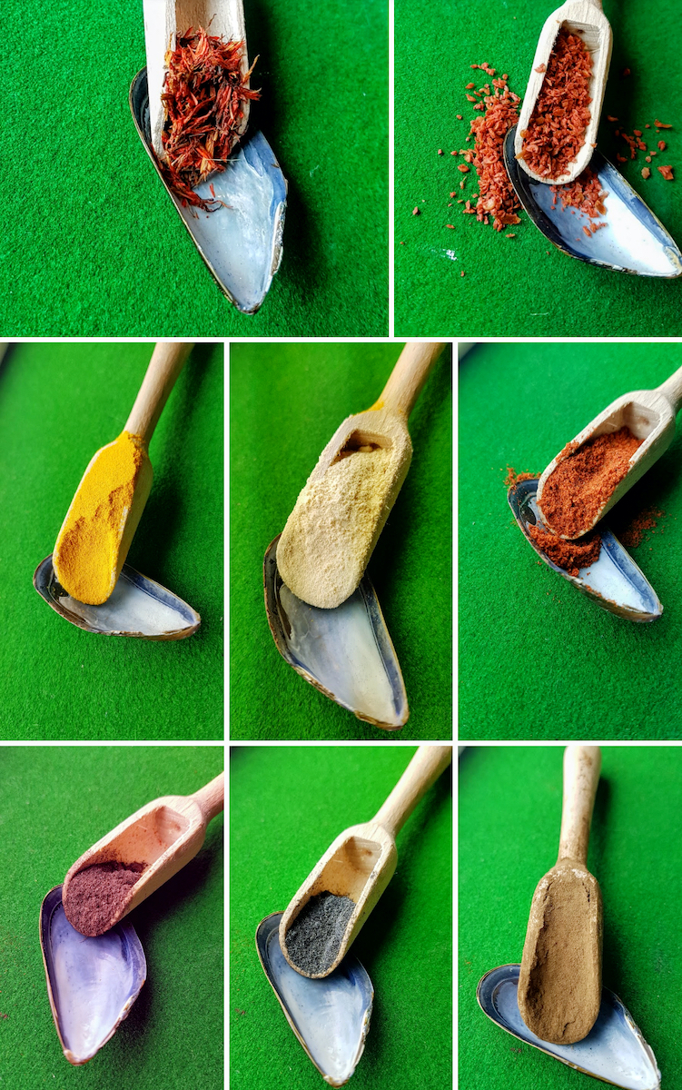
We think of purple as royal.* Do we feel entitled to something? Is something making us feel special? Or is it making us feel “dethroned” and “bruised”? Are we using our position for good—or do we need to? Do we need to question our “altruistic” behaviour? Is it truly altruistic? How do we feel about our service to others? Yellow is the bright and happy Sun. It brings illumination and clarity, confidence and knowledge. How do we feel about that? We can associate the bright light of the Sun as a glorious spotlight upon us as we perform on this earthly stage, or maybe it’s a blinding spotlight from which we can’t hide. Maybe, thanks to the ancient Egyptians, we think of the Sun as a masculine energy and as such yellow is often considered a masculine color. It can represent the ultimate protagonist in our sky story. Who is the protagonist in ours? How is our story unfolding? And what may we need to illuminate? How may this be significant in your life? Blue is the color of an expansive cloudless sky and tends to offer us the feminine, maternal attributes of love, reflected in the etymology of the sea, water, purity, and motherhood—mere.** How is our relationship with the maternal aspects in our life? Are we drowning or swimming free? Are your waters limpid and teaming with life, or cesspools with old soda pop cans and plastic-waste-throttled fish belly up, going nowhere. Is the ocean stormy and terrifying? Is the blue dark and foreboding like the heavy aspect of a dark mother?
Much as we associate purple with royalty,* this is a legacy that we have collectively agreed upon, even though many have forgotten why. We can do the same with many things. Culturally, colors can have very differing meanings that will affect how people will relate to them. White is often considered angelic and pure, while in some cultures it is the color of mourning. However, it is worth noting that apparent opposites may not be as polarized as we imagine. Does death not take us into the angelic realm, after all? White can be like a thick fog, a blinding blizzard, or a calm blanket of snow. Do you like snow? Are you frozen? Is it like a blank canvas ready for color? Brown can be like earth. Grounded and rooted like a tree. It can be like mud or like sand. Is the manure waste or fertilizer? How might this reflect how you feel about yourself or a situation? Black can feel like an abyss, a deep cave or grave, or the cosmos just before the spark of life with all the potential held within it. How we feel about a color is the key.
We can think of the watery nature of blue, the fire of red, and the illumination of yellow. All color combinations will have aspects of these elements. Orange, as an example, will take the passion of red with the intellect of yellow to create willful ambition. Take the masculine illumination of yellow and the mother love of blue, and you have the nurtured germination of green. The steamy marriage of fiery red and watery blue gives us purple. Is there a polarizing aspect between the luminescence of yellow next to a dark heavy blue? From these couplings you can also begin to picture how these colors may act as metaphors for issues when the colors sit next to each other rather than mixed together. The heat and cold of red and blue feel like a power struggle, whereas blues, greens, and yellows feel like all the ingredients for flourishing life.
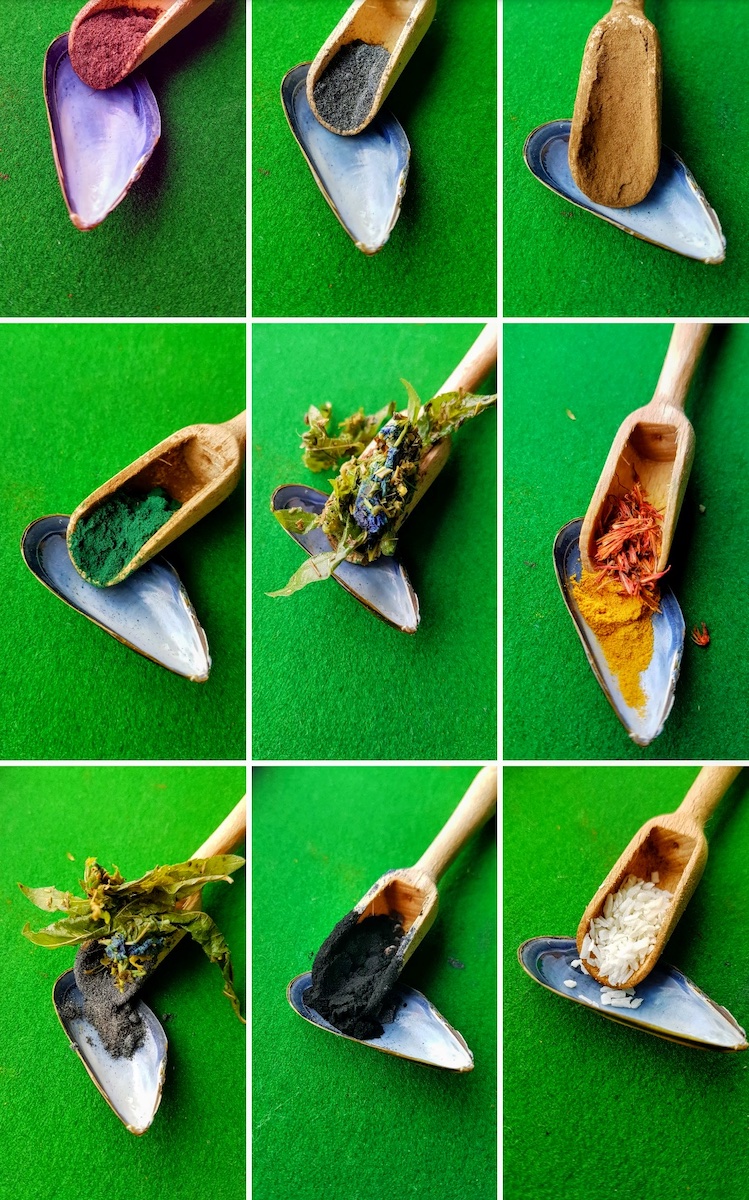
So, reflect on the images that you may have drawn and colored over the last few weeks. Is there an overall tone that feels like a season? Is it bright and pastel like spring, full of naivety and potential? Or the richer clarity of summer colors, full of adulthood and abundance. The warm hues of autumn and its harvest and closing down of life? Or the winter coldness as colors turn fallow? Read your journal and see how the image correlates with what you have written. See if the colors, who the deity is, and what they represent give insight into what you have written and how you felt at that time.
Psychologically, this is far more profound than one can initially assume. It is a deep and complex subject that can prove highly insightful. These practices can be comducted safely at home, and hopefully provide some interesting food for thought.
* Tyrian purple comes from the gland of small sea mollusk called a murex. It was produced in only one place on earth: the shores of modern Lebanon, and required 12,000 molluscs to produce only 1.4 grams of pure dye, which meant that a handful was worth more than a modern house. Another curious and rare quality of this color was that it became more brilliant in sunshine, a very desirable trait for those aspiring to look splendid and have a garment with such longevity, so it was extremely valued. Needless to say, it was reserved for only those who could afford it, and that was royalty. Fortunately, not least for the murex, in 1856 an 18-year-old British student chemist discovered a synthetic version, calling it “mauveine,” which meant everyone could have some purple. To this day we consider the Tyrian hue far more regal than mauve without even knowing why.
** It’s interesting to note that until the Egyptians there was no word for “blue.” It was as if the color didn’t exist to us humans. The color was suggested by example: “the sea was the colour of dark grape wine” or “her robes were the color of the hazy sky at the dawn of a winter’s day,” and so on.
See more
Tilly Campbell-Allen (Dakini as Art)


